World Cup Squads
Arthur Gymer
2019-09-10
A (very) Brief History
It took 116 years from the first test match but in 1987 the inaugural Rugby World Cup kicked off in the storied Eden Park; New Zealand dismantling Italy in front of 20,000 fans. Making up the invitation-only field were 16 teams of totally amateur players, almost all of whom played their club rugby on home soil.
In the intervening 32 years rugby has seen massive and rapid change; the advent of professionalism in 1995 sending shockwaves through the sport, from which some would argue it has never recovered.
But the genie is out of the bottle and there is no looking back. With more money flowing into the game year-on-year, and players seemingly ever-increasing in size, the demands of the game have changed.
So, inspired by this reddit post I decided to take a look at every squad ever sent to the World Cup and how they have changed in 3 decades.
The Data
The bulk of the squad data were scraped from Wikipedia pages for Rugby World Cup Squads found at https://en.wikipedia.org/wiki/YYYY_Rugby_World_Cup_squads.
Some missing caps data (Namibia ’07 & Scotland ’07) and all test match data were scraped from ESPN Scrum’s Statsguru
All scraping was done in python using pandas and beautifulsoup.
There are still 63 entries without birthdays, almost all (50) from the 1987 competition. They are excluded entirely from any age analysis.
The Teams
Since that first game 25 nations have competed in at least 1 World Cup. 11 of those teams have turned out for every iteration; South Africa the biggest name missing from the list, with anti-apartheid sporting boycotts keeping them away from the ’87 and ’91 events. Samoa (or Western Samoa as they were then) can feel hard-done by to not make the cut, having been snubbed from the invite-only 1987 showpiece.
| Country | 1987 | 1991 | 1995 | 1999 | 2003 | 2007 | 2011 | 2015 | 2019 | Total |
|---|---|---|---|---|---|---|---|---|---|---|
| Australia | 9 | |||||||||
| England | 9 | |||||||||
| Wales | 9 | |||||||||
| Ireland | 9 | |||||||||
| New Zealand | 9 | |||||||||
| Italy | 9 | |||||||||
| Argentina | 9 | |||||||||
| France | 9 | |||||||||
| Scotland | 9 | |||||||||
| Japan | 9 | |||||||||
| Canada | 9 | |||||||||
| Romania | 8 | |||||||||
| United States | 8 | |||||||||
| Fiji | 8 | |||||||||
| Tonga | 8 | |||||||||
| Samoa | 8 | |||||||||
| South Africa | 7 | |||||||||
| Namibia | 6 | |||||||||
| Georgia | 5 | |||||||||
| Uruguay | 4 | |||||||||
| Zimbabwe | 2 | |||||||||
| Russia | 2 | |||||||||
| Ivory Coast | 1 | |||||||||
| Spain | 1 | |||||||||
| Portugal | 1 |
| Tier 1 | Tier 2 | Tier 3 |
|---|
Whilst there was representation from Zimbabwe and Ivory Coast at the early editions, it’s notable that since the dawn of professionalism - even with the field growing from 16 to 20 teams - no Tier 3 team has taken part.
Caps
Since we were inspired by a simple look at the average number of caps and age, let’s start there.
Figure 1 shows that there is a clear trend towards players with more caps in World Cup squads. The median caps rose steadily from 1987 before starting to level off between 2015-19, whilst there was a noticeable bump in the upper bound of the interquartile range from 2007. This suggests that even though the outliers, the McCaw’s and O’Driscoll’s, are reaching cap numbers nearly double the highest in 1987, they are not the only reason for the average increase; the average player is also becoming more capped.
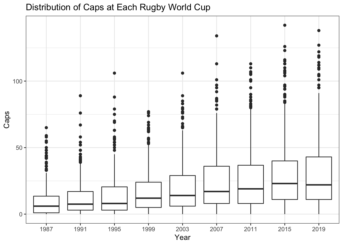
Fig. 1: Caps per World Cup
So what is the cause of this increase? A pressing issue in World Rugby lately has been player welfare, with many leading players pushing for fewer games amid ever-more crowded international and domestic calendars. Is the average World Cup attendee more capped simply because there are more tests played in 2019?
Figure 2 shows the number of tests per year played by every nation from the decade before the inaugural World Cup until the end of 2018. Points are sized by the number of teams playing that many tests and have been jittered to make it easier to distinguish.
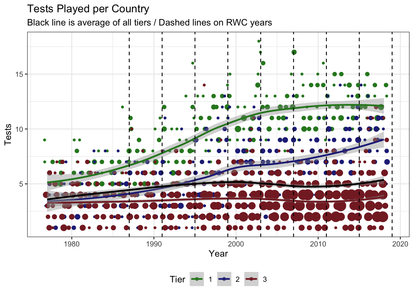
Fig. 2: Tests Played by Nation
It is very clear that there has been a marked incread in the number of Tier 1 test matches played per country. There is also a less pronounced increase in the number contested by Tier 2 teams, with litte change in the overall average or the average Tier 3 number. The overall average is probably kept suppressed by the fact there are so many more Tier 3 nations than Tier 1/2 (Figure 3).
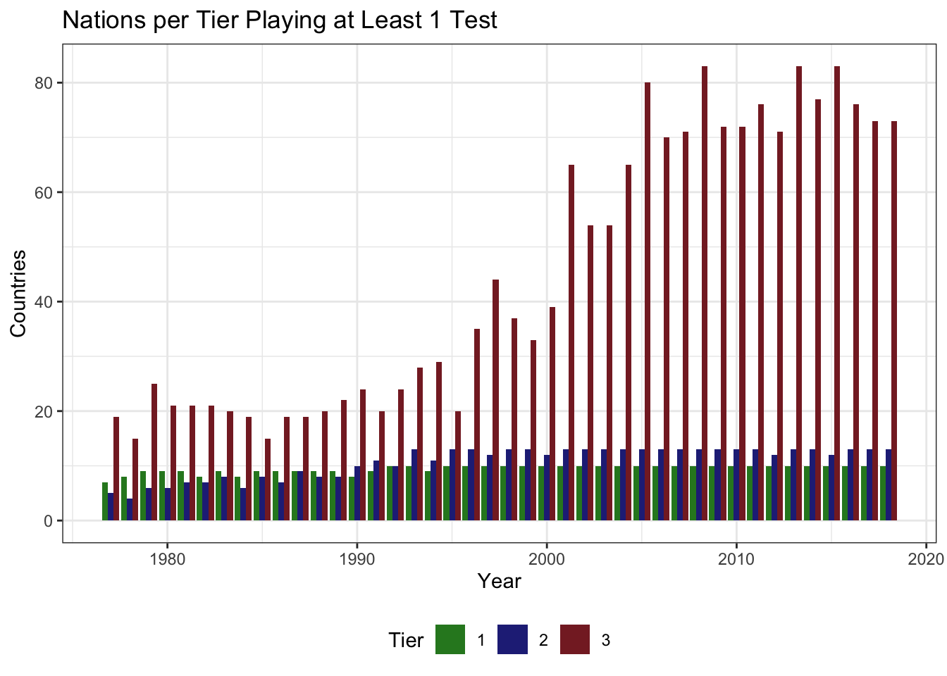
Fig. 3: Nations Playing Tests
What Figure 2 also shows us is that there is clearly a growing divide between the haves and the have-nots. The small-circle of 23 Tier 1 and 2 nations, who have all competed in at least 1 World Cup are the ones increasing the number of lucrative and exposure-granting test-matches they play; further digression on this point is for another day however.
Figure 4 shows that when you compare the change in median caps available per World Cup cycle to the change in median caps per World Cup squad member there is reasonable correlation; the increase in caps per player can be attributed to the increase in available caps.
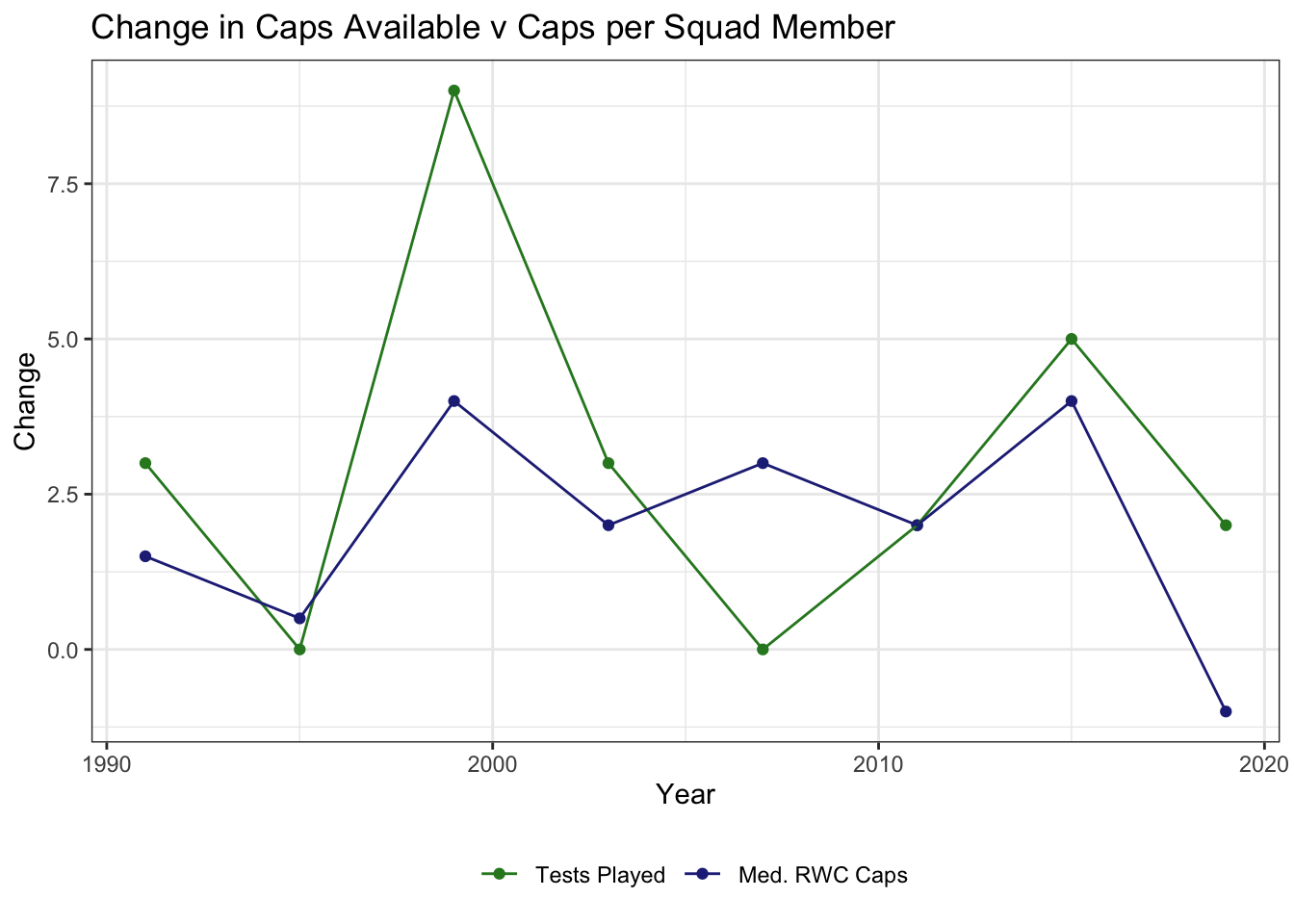
Fig. 4: Caps Available v Squad Caps at the RWC
Age
So there are more caps to be won, specifically for the regular World Cup contenders, which it seems largely explains the increasing average cap count of the squads but is there anything else to be gleaned from the data?
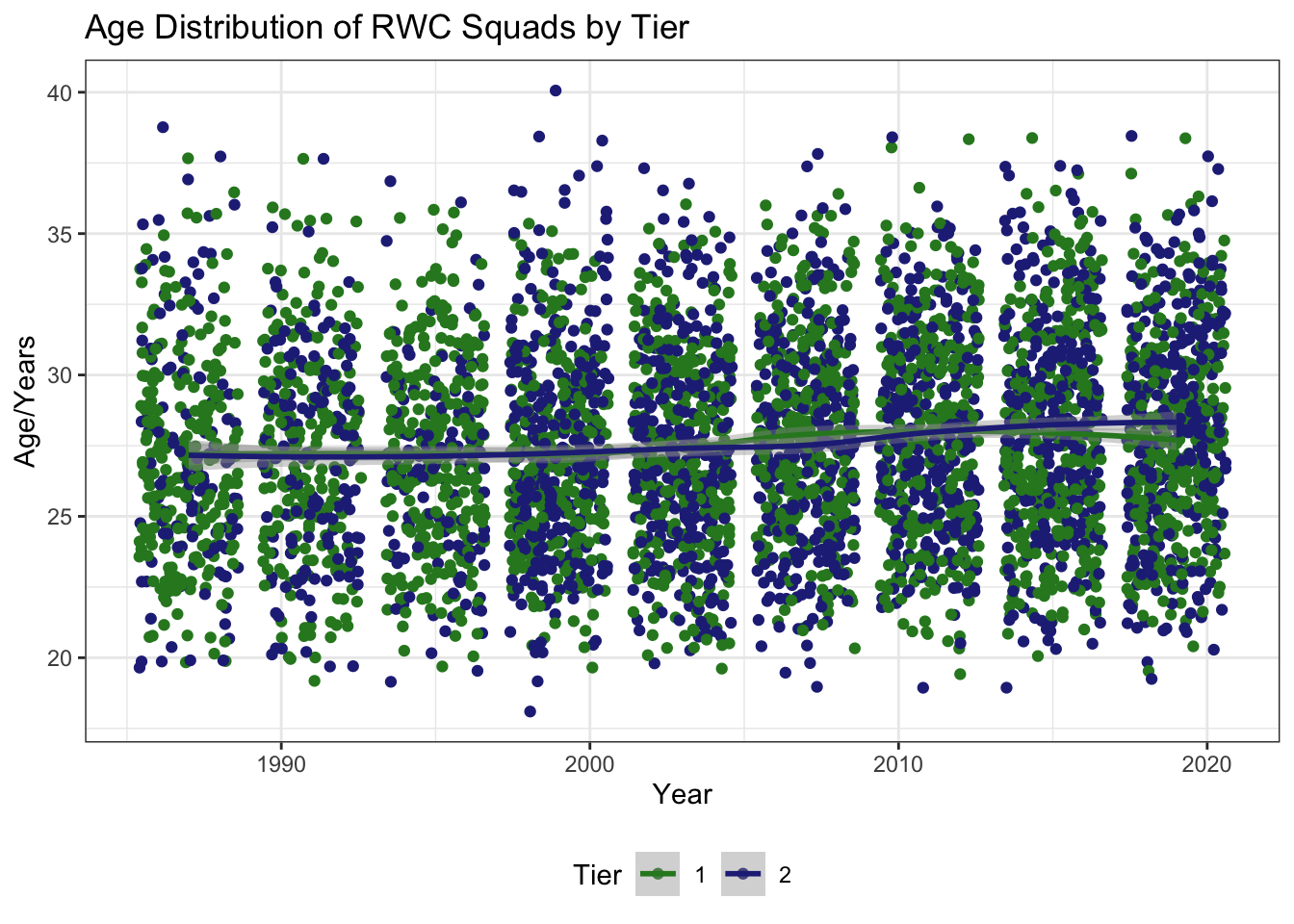
Fig. 5: Ages at the RWC
Although there is a slight increase in the average age of RWC squad members Figure @ref(fig:age-plot) shows that it is not significant in any way (points are jittered).
Clubs
The Wikipedia datasets also contain information about which clubs each squad member is associated with. However a cursory inspection of this data shows that there is much cleaning required to reconcile subtle differences between the 952 different clubs listed; many clubs appear with different formats e.g. RFC v R.F.C
So with that caveat in mind, let’s take a look at the proportion of players plying their trade overseas at each World Cup.
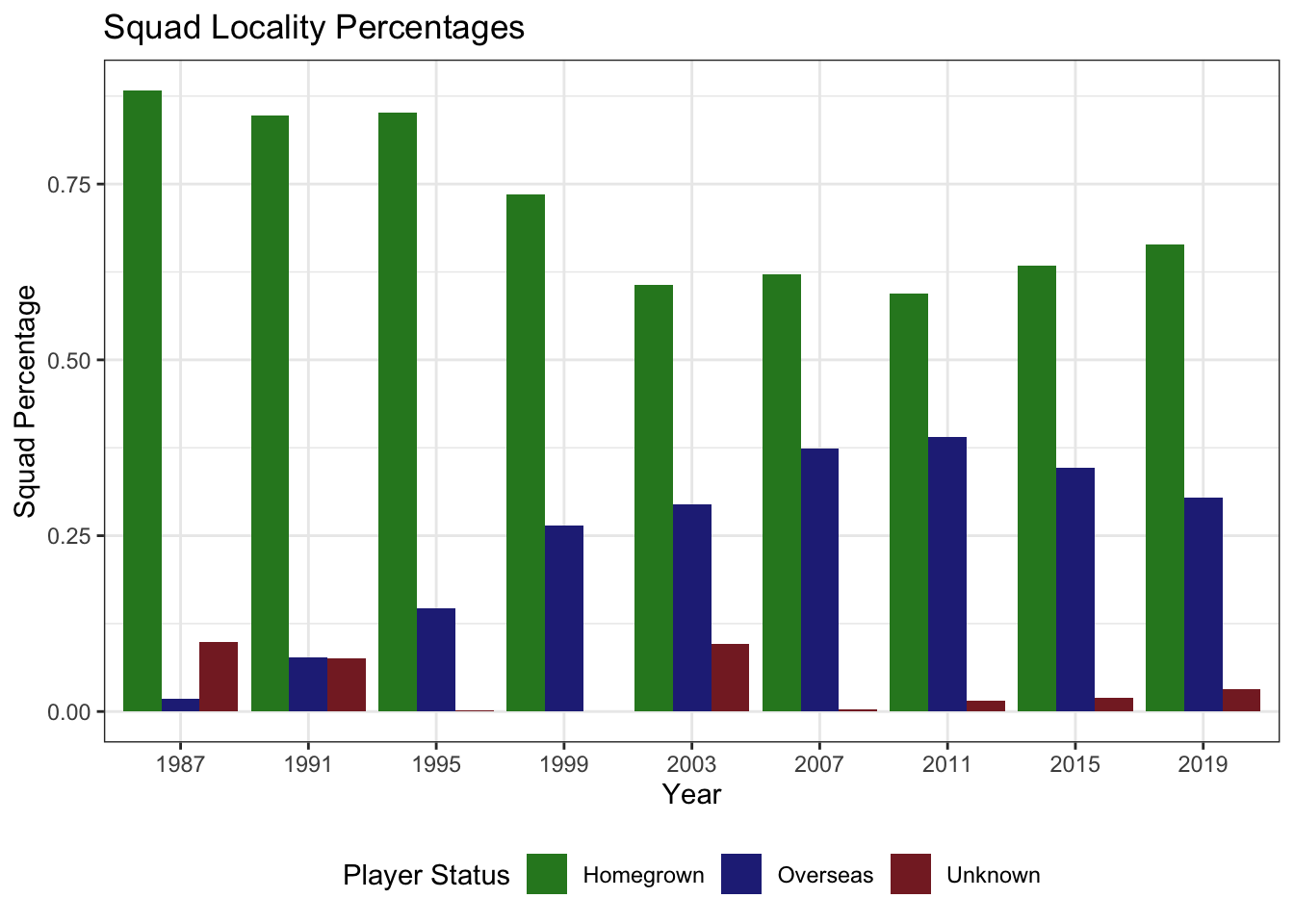
Fig. 7: Where Do RWC Players Make Their Money?
It is quite clear then, from Figure 7, that the percentage of players playing their club rugby abroad has greatly increased. The increase is quite evident between 1995-’99 when the game went “open”, although it appears that the number of overseas players in squads may be falling - possibly a result of recent union directives, such as the “Giteau Rule” implemented by Australia, which keep all but the most senior members of squads from representing their home country whilst playing abroad the rest of the time.
The story is not yet over though, accusations of poaching abound, with the big-money leagues of France particularly maligned. Can the World Cup squad data add any weight to the emotion?
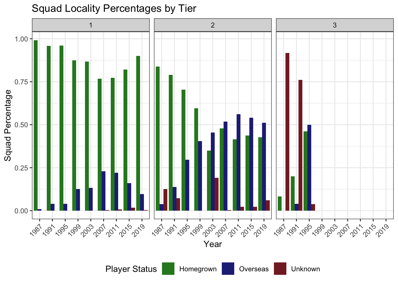
Fig. 8: Poaching? Moi? Non.
So Figure 8 would make it look like the leagues in the Tier 1 nations have been increasingly luring away the Tier 2 stars with bigger pay packets; again expounding on the merits or otherwise of this is a discussion for another day.
It is also clear that data for Tier 3 players is harder to come by, or at the very least, those clubs are not big enough to merit a Wikipedia entry!
So where are these overseas players making their money? (National team on the left, club league on the right)
Here you can step through each iteration of the tournament and also see a cumulative dataset. It is very apparent that between 1995 and 1999 the move to professionalism resulted in an explosion of overseas players in club leagues. As time has progressed and money has started to be put into growing the game, there has been an increase in the number of countries club leagues represented. However it seems evident that the French and English leagues, flush with TV money, continue to hoover up talent from abroad.
Thanks for reading!
If you made it this far, then thank you! I hope you enjoyed the graphs and maybe learned something you didn’t know already!